1.6
Greentrace
Client: Greentrace.io
Deliverables: Logo & Brand Identity
Skills/Tools: Logo Design, Graphic Design, Adobe Illustrator, Adobe Photoshop, Typography, Color Theory, Branding
Greentrace Project Case Study
Project Overview
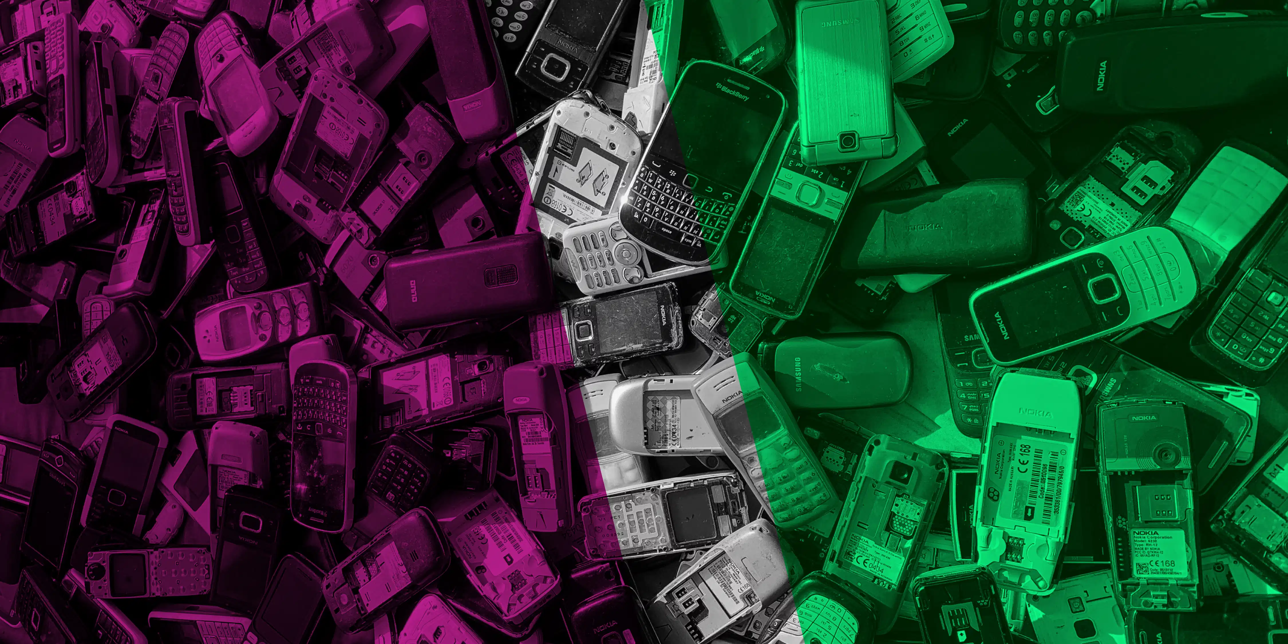
GreenTrace is an electronic waste tracker built on top of the Telos Blockchain Platform. It verifies all the electronic components belonging to their products and offers a platform to reward producers & consumers with cryptocurrency for recycling the components/product. The crypto – Sarafu – is linked to a licensed border payment system that matches 1:1 with the (fiat) Kenya Shilling.
I designed its brand identity.
Deliverables
- Logo
- Typography
- Color Palette
- Social Media Graphics
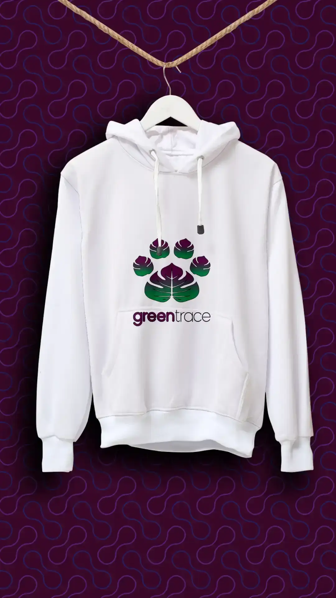
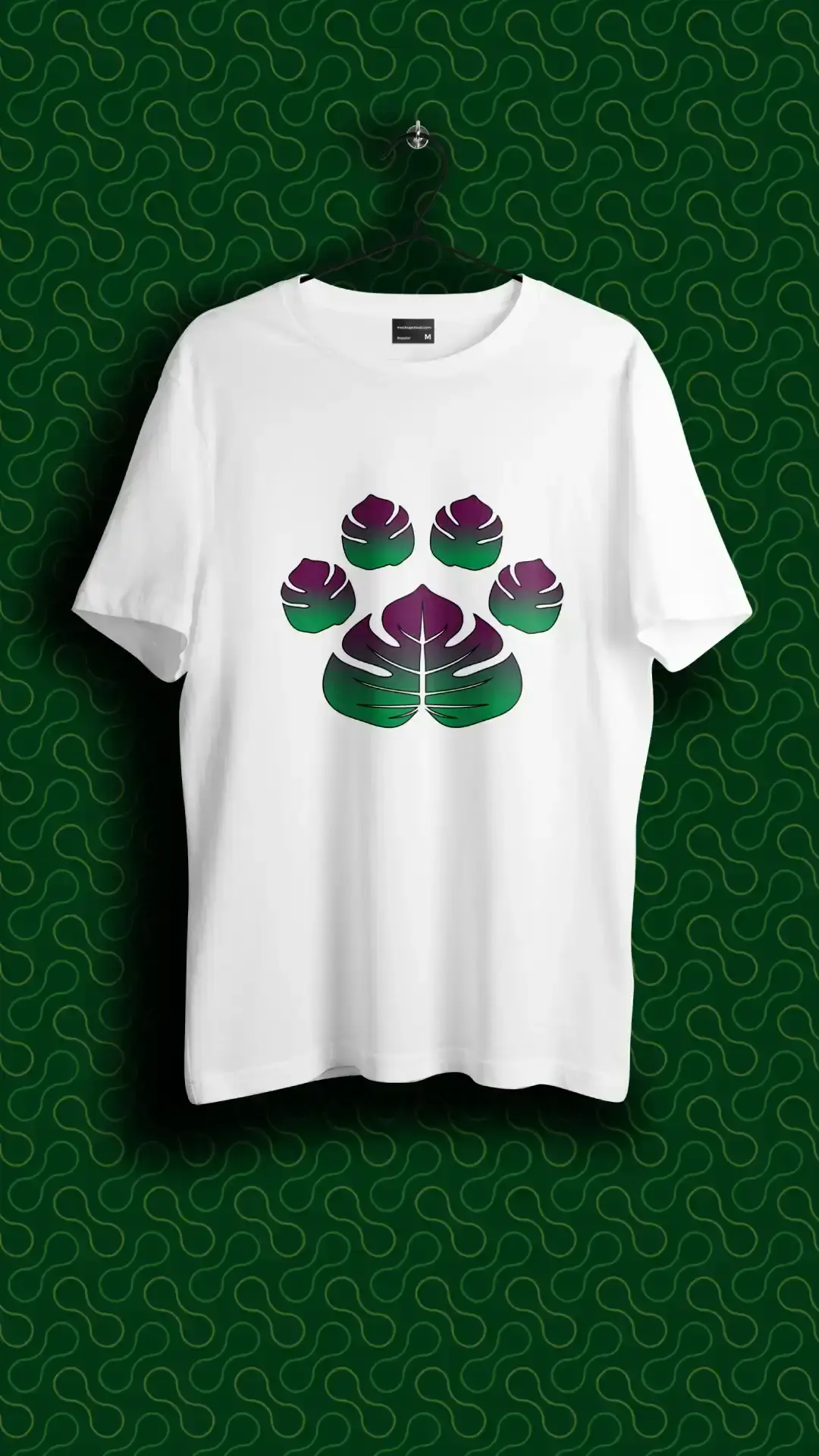
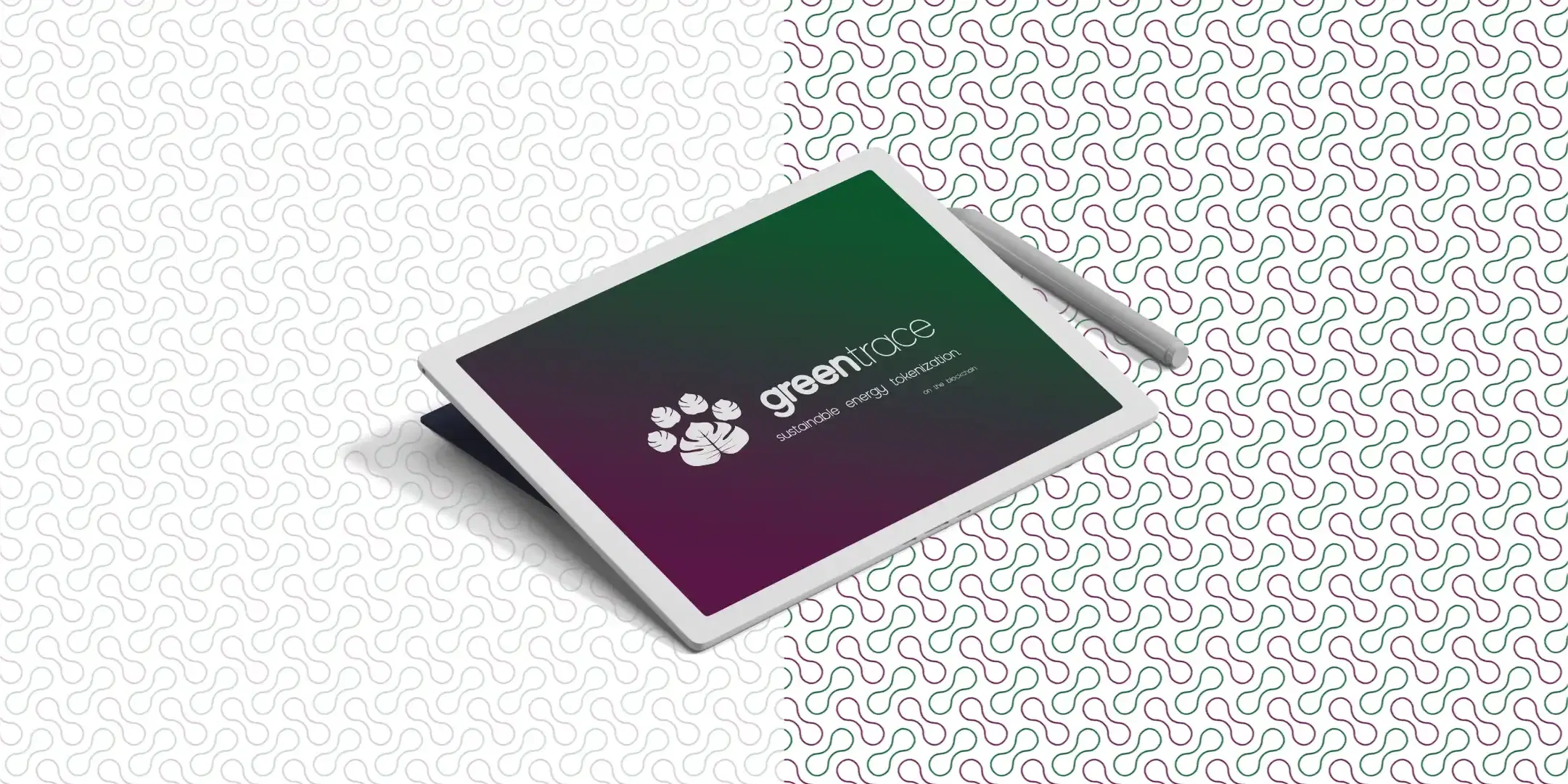
- Brand Collateral
Target Audience
Kenyan electronics producers, retailers, recyclers, and environmentally conscious consumers seeking a transparent, traceable, and financially rewarding approach to electronic waste recycling.
Brand Personality
| Trait | How it Presents |
|---|---|
| Innovative | Uses blockchain and digital technology to solve a real environmental problem. |
| Trustworthy | Verification and traceability are central to the product, so the brand should feel credible and transparent. |
| Responsible | Promotes proper e-waste management and a circular economy rather than simply focusing on cryptocurrency. |
| Empowering | Rewards producers and consumers for making environmentally responsible choices. |
| Accessible | The concept connects sophisticated technology with an everyday incentive—the Kenya Shilling—making the system easier to understand and participate in. |
| Progressive | Positions recycling and electronic waste management as part of a more sustainable technological future. |
| Community-minded | Encourages multiple stakeholders—producers, consumers, collectors, and recyclers—to participate in the same ecosystem. |
Design Strategy
Circuits, wires, nodes, screens, etc, are standard design elements in tech-related imagery. It is also overused, and adding them to this project would risk making it look too much like other logos and visual elements in the industry.
It had to be different. Easy to recognize. And still communicate "Web3" and "Sustainability".
Logo Design
Circuits, wires, nodes, screens, etc, are standard design elements in tech-related imagery. It is also overused, and adding them to this project would risk making it look too much like other logos and visual elements in the industry.
It had to be different. Easy to recognize. And still communicate "Web3" and "Sustainability".
Discovery
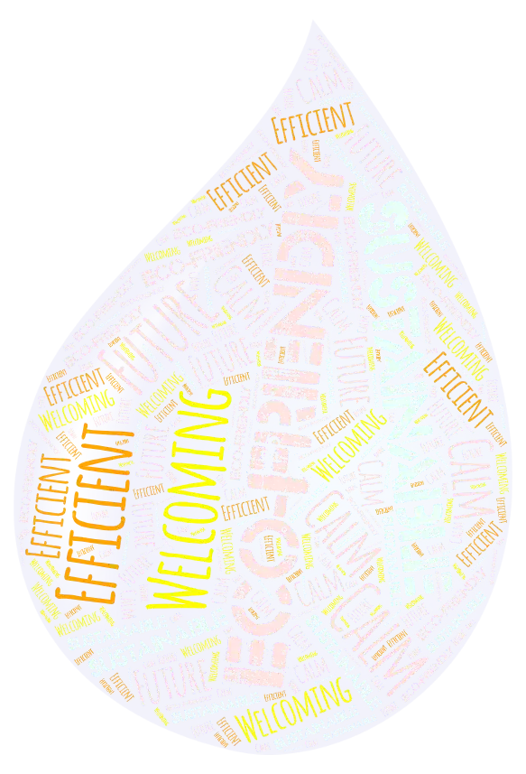
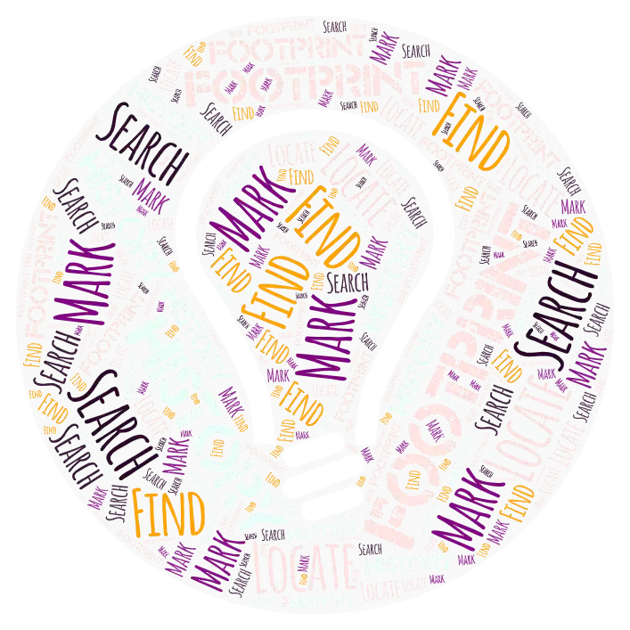
I split the name into two words: "green" and "trace", and found synonyms for each.
Logo Concepts
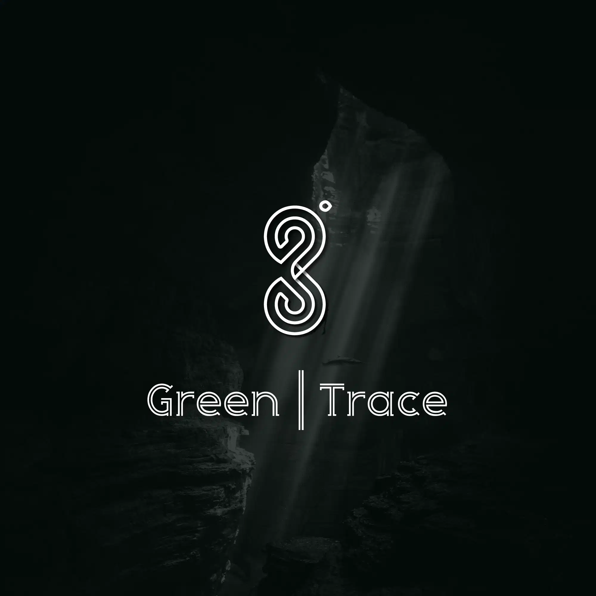
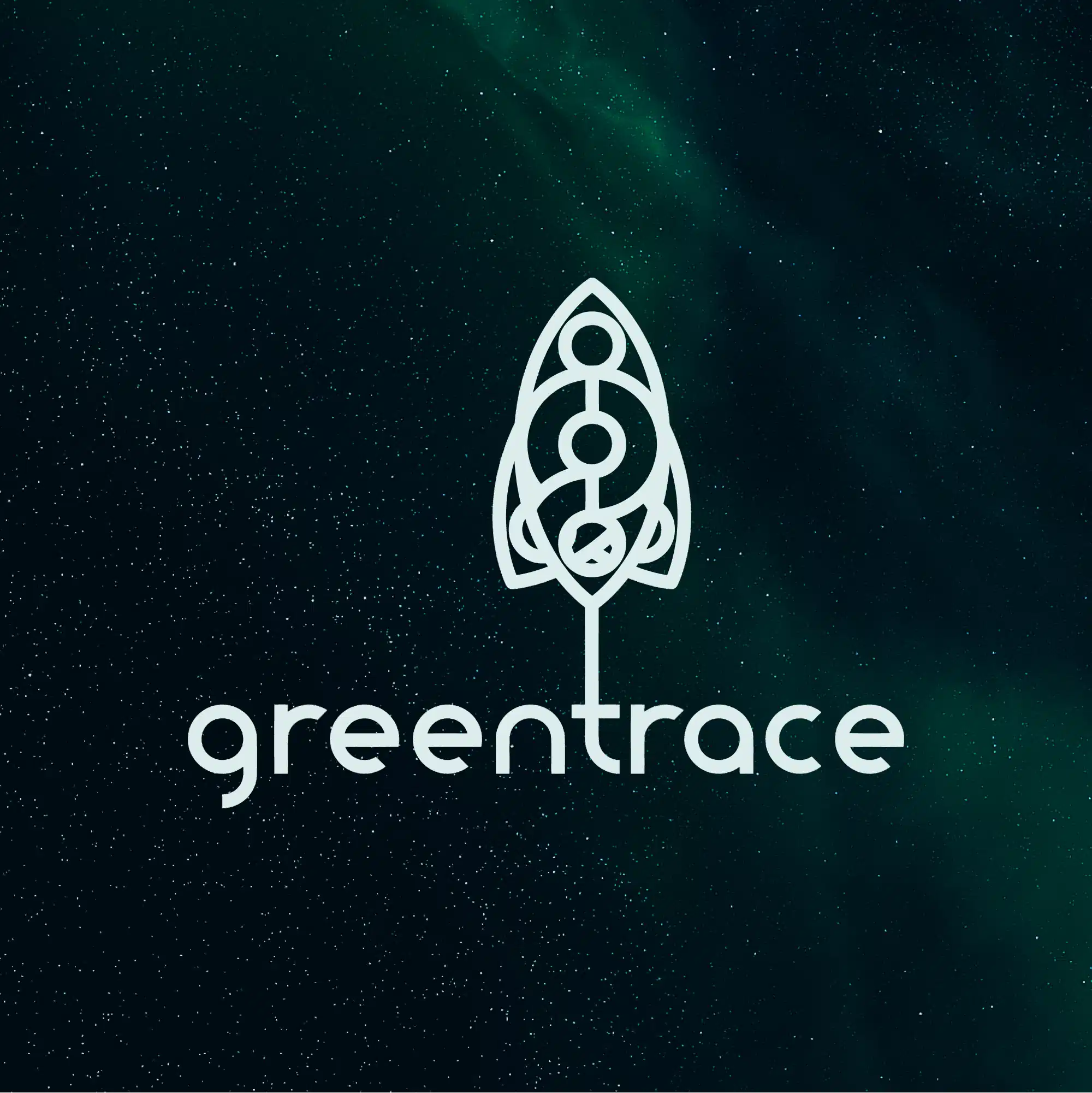
Keywords from the synonyms were used as elements in the logo design concepts.
Chosen Logo Concept
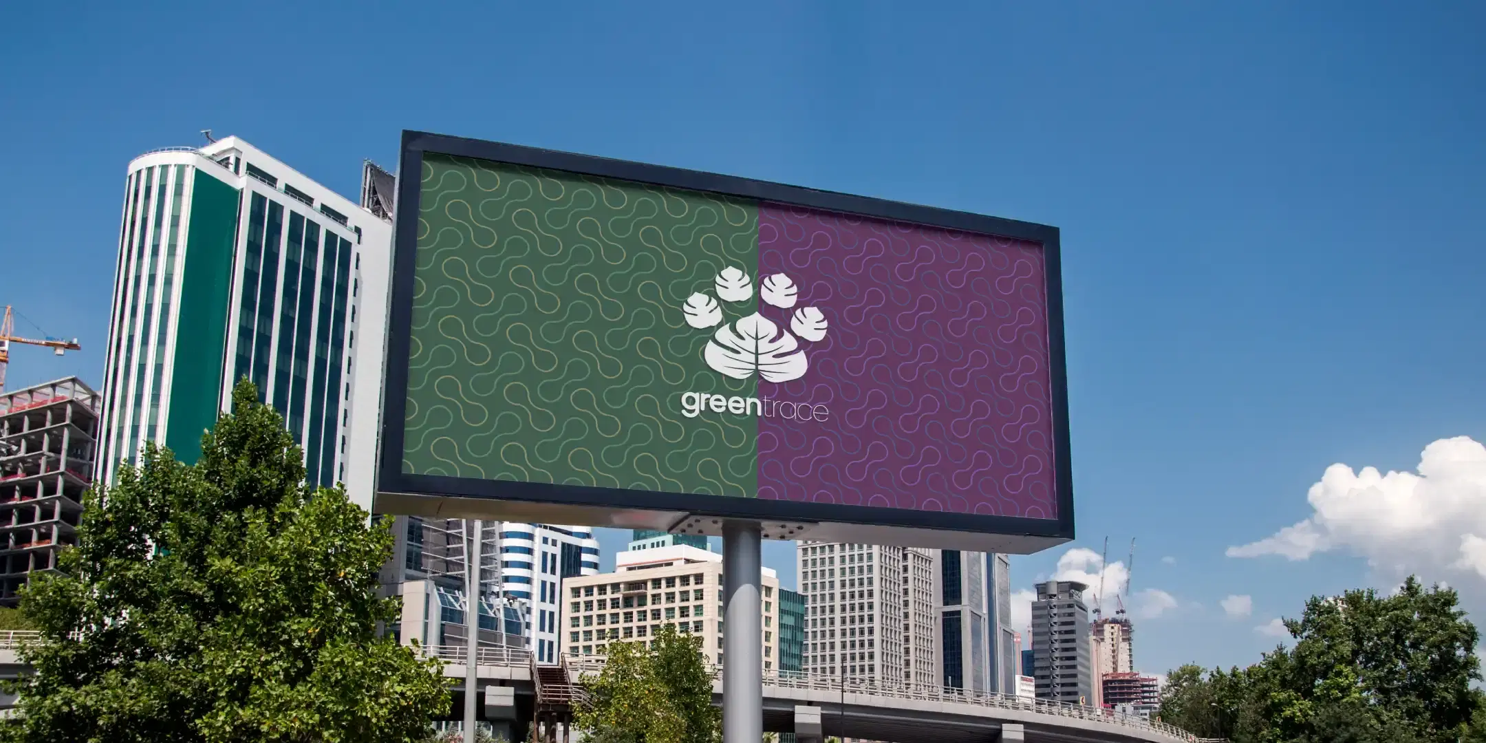
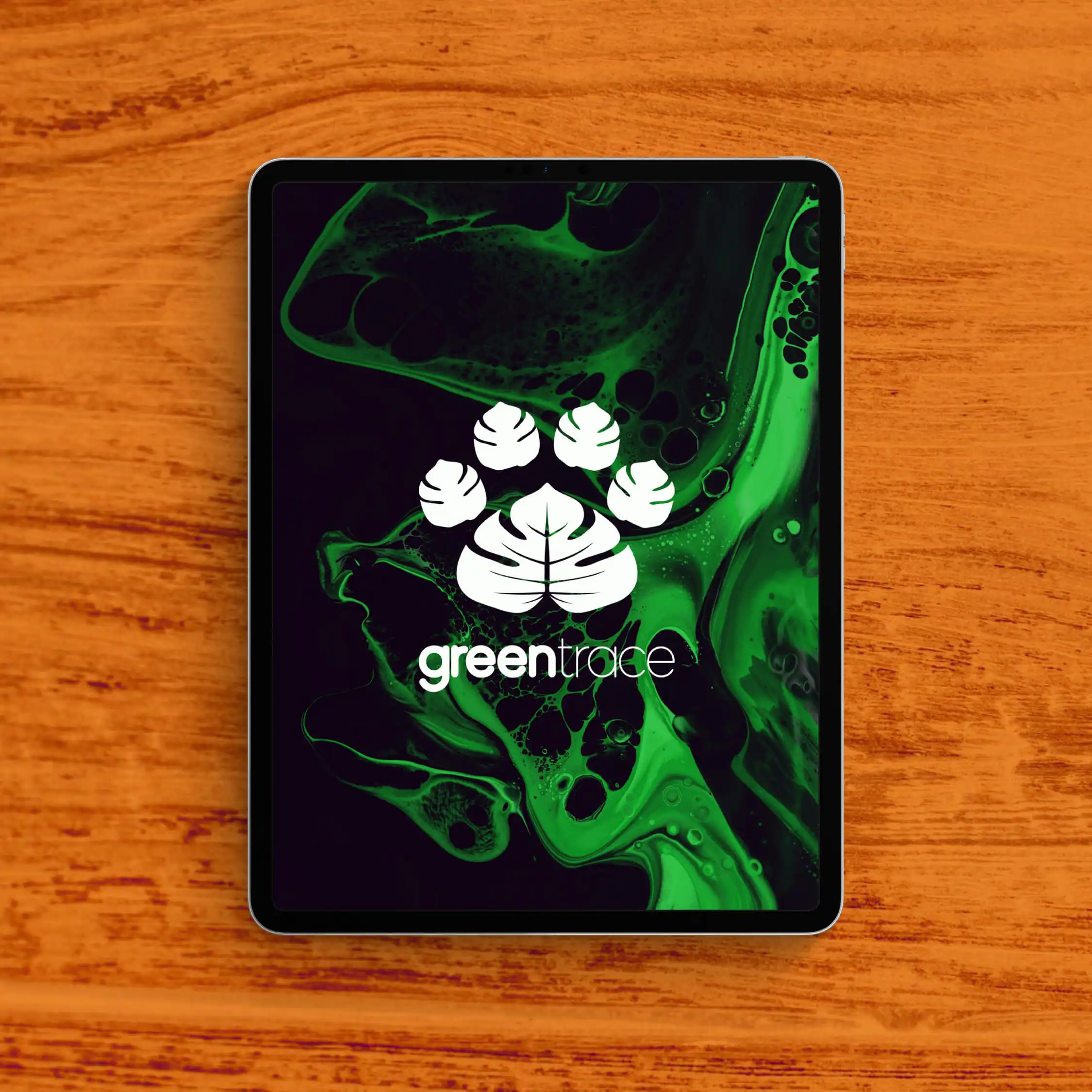
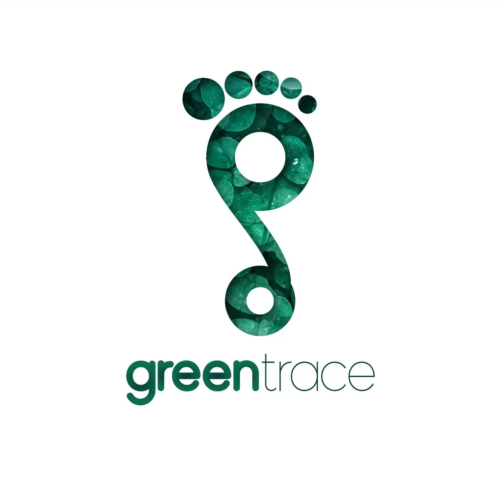
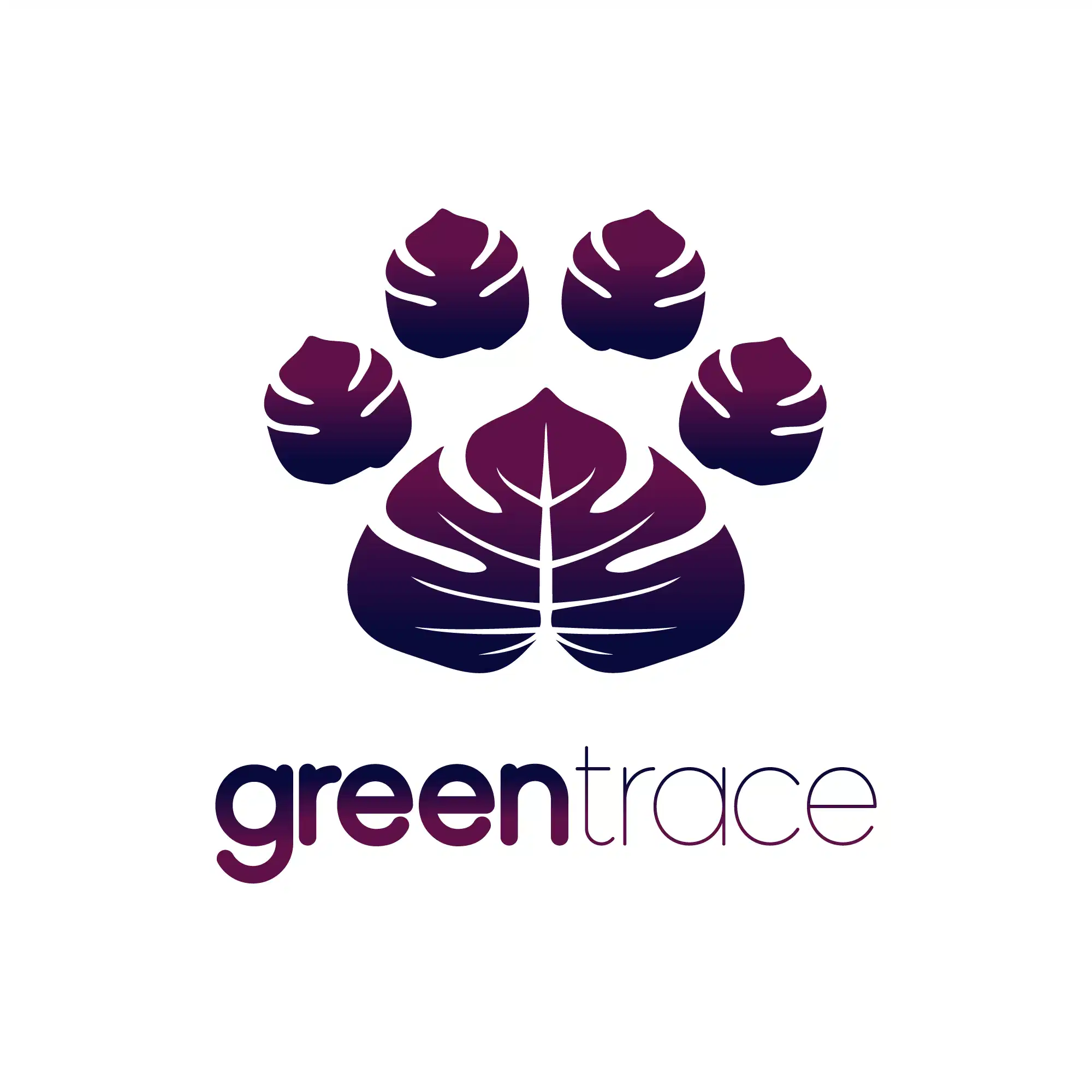
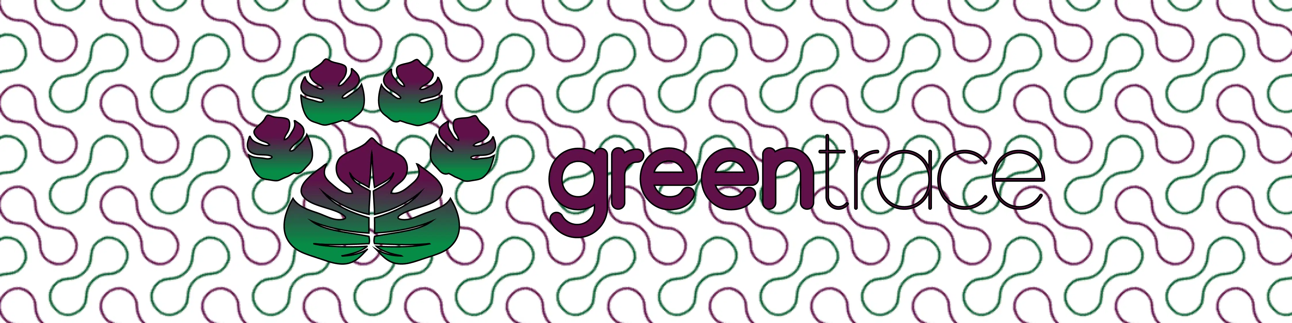
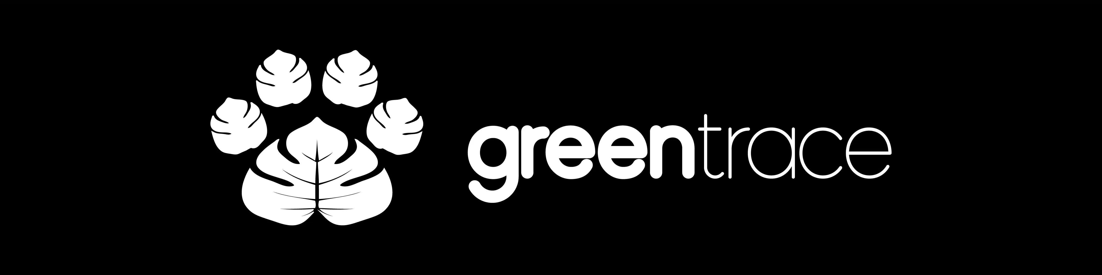
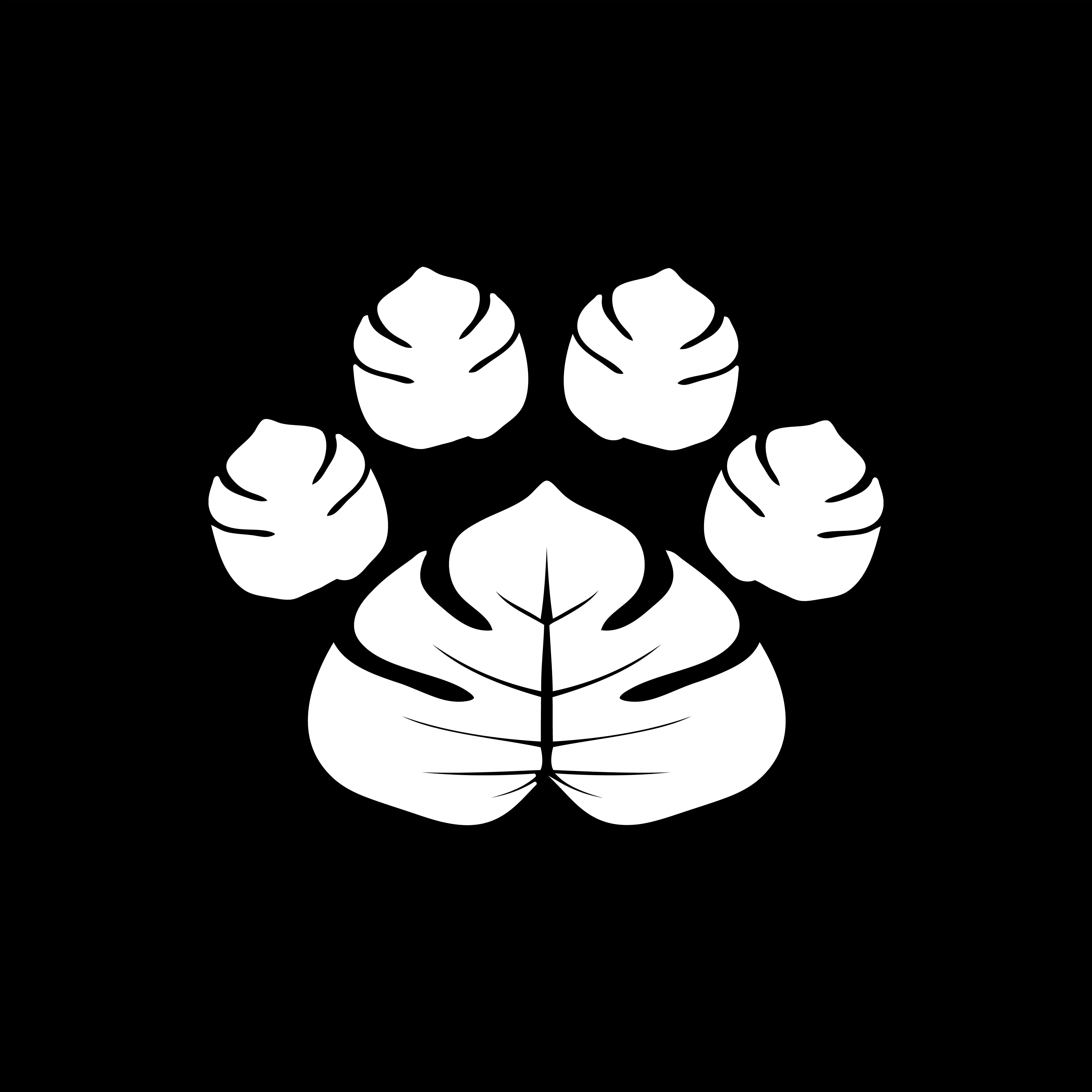
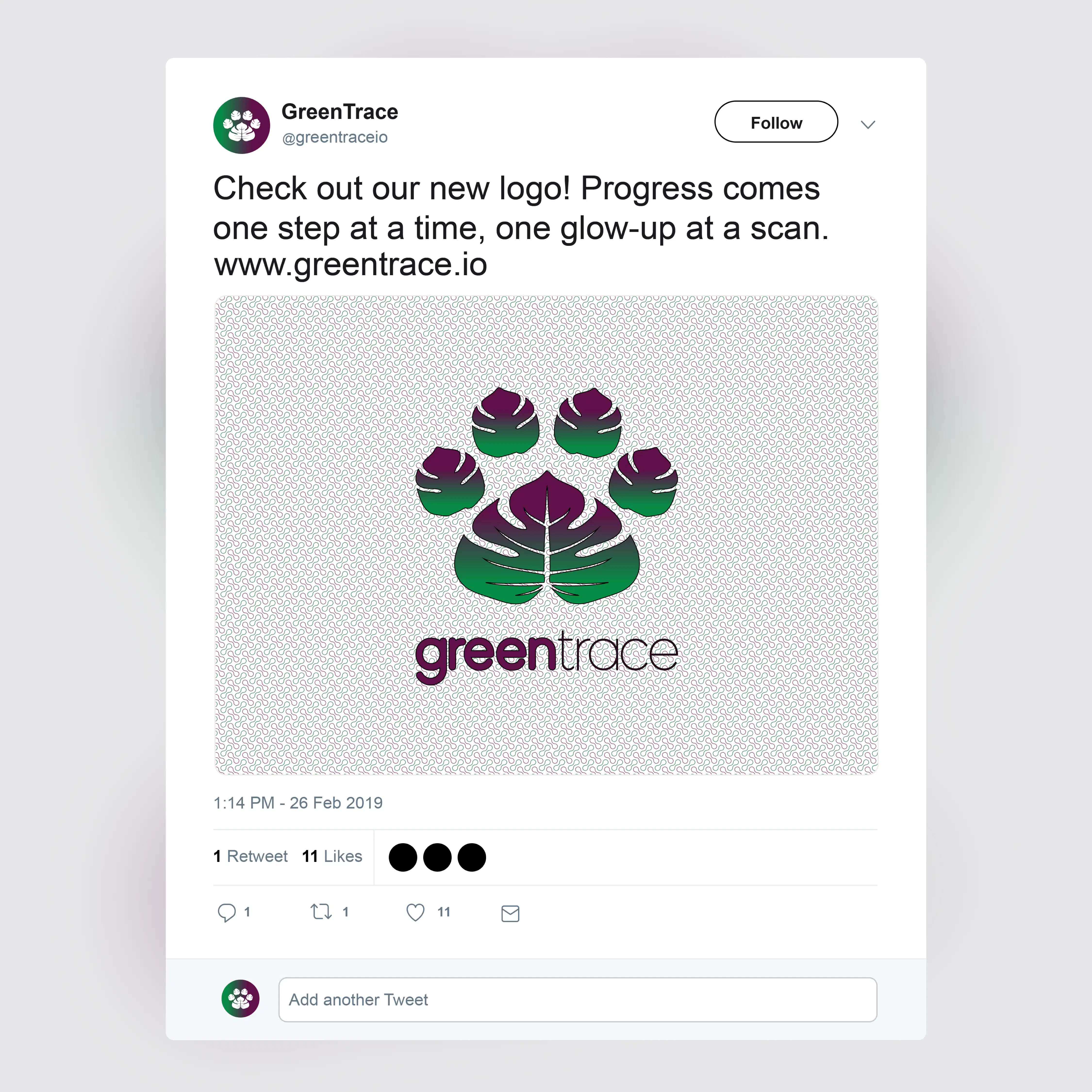
Tropical leaves arranged to resemble a pawprint.
Full color
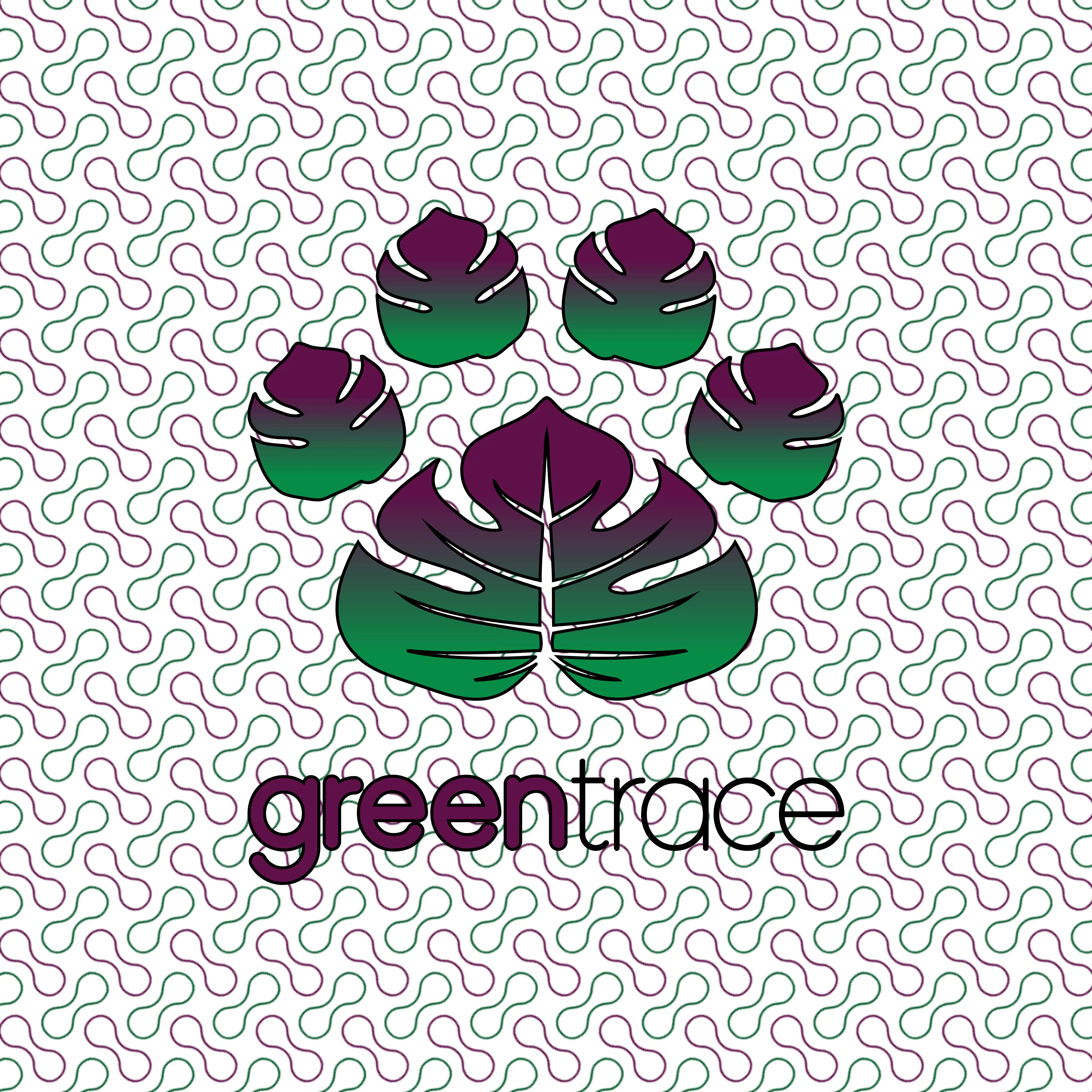
Reverse gradient

Black on white
White on black
Typography
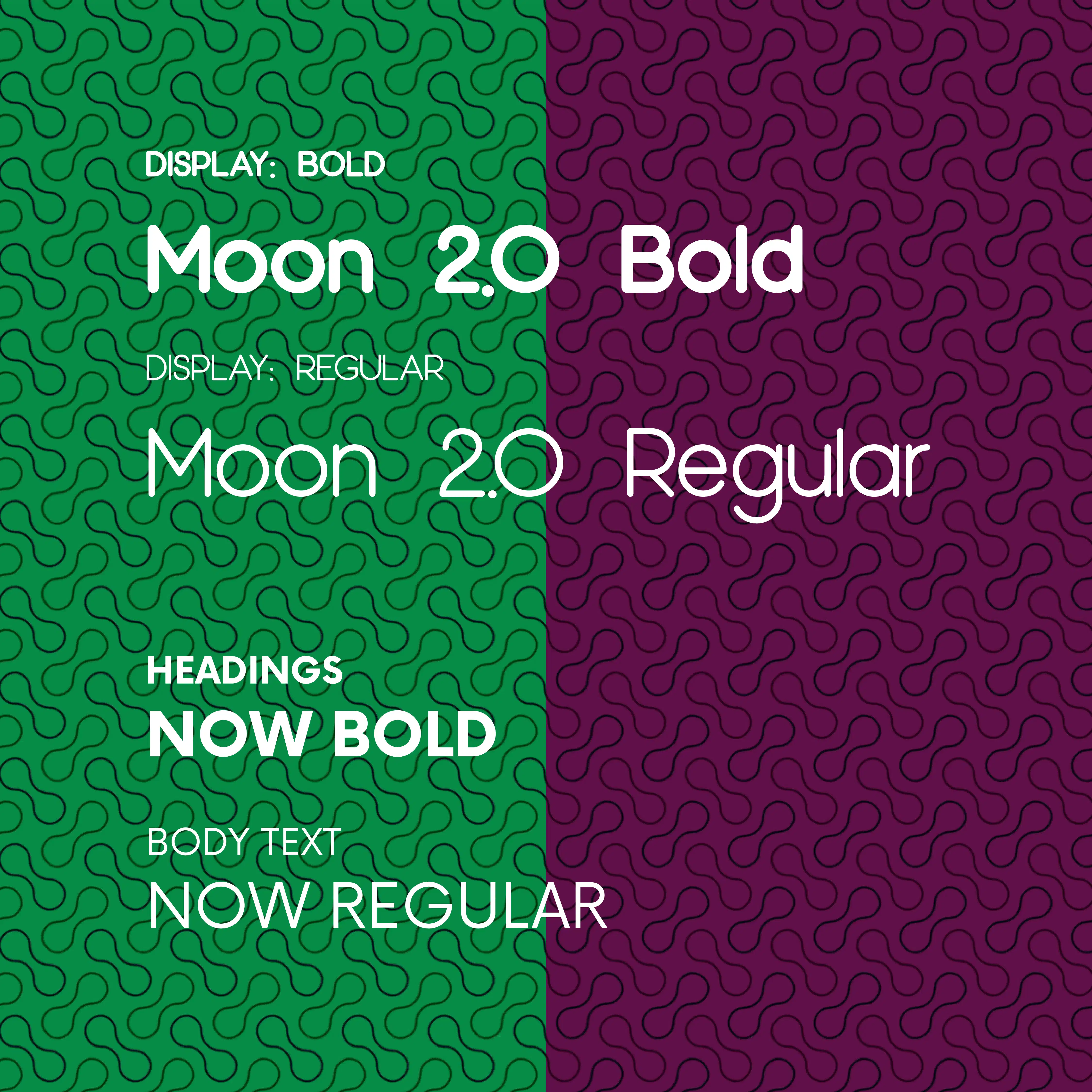
Typeface choices were guided by the need to communicate "technology", "credibility" and "accessibility" while also allowing for numerical clarity: neccessary for transactions and rewards.
Which means modern, humanist, sans-serif fonts.
Color Palette
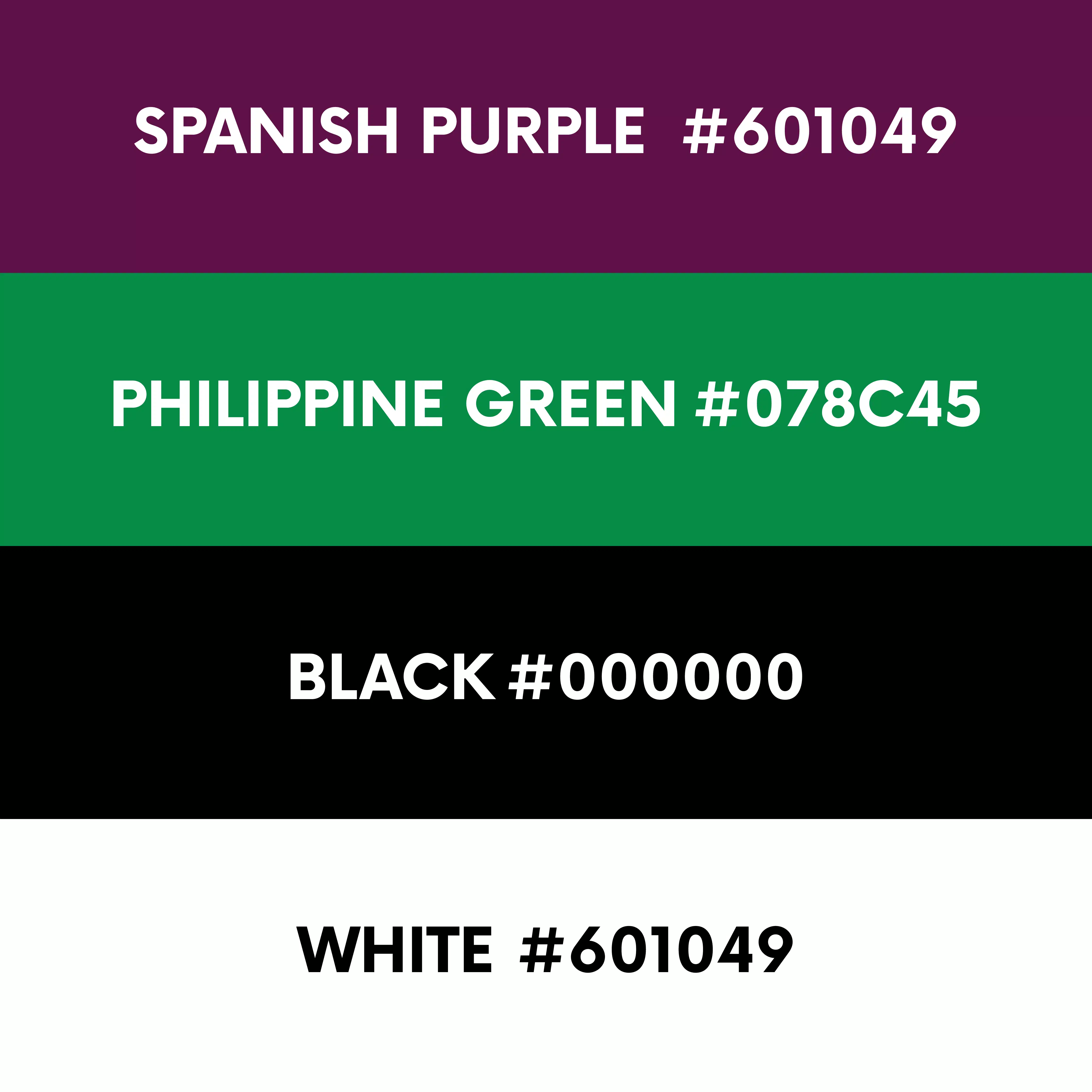
Colors were chosen based on the brand personality, industry-relevant visuals and enviromentally-conscious hues.
Social Media Graphics
Brand Collateral